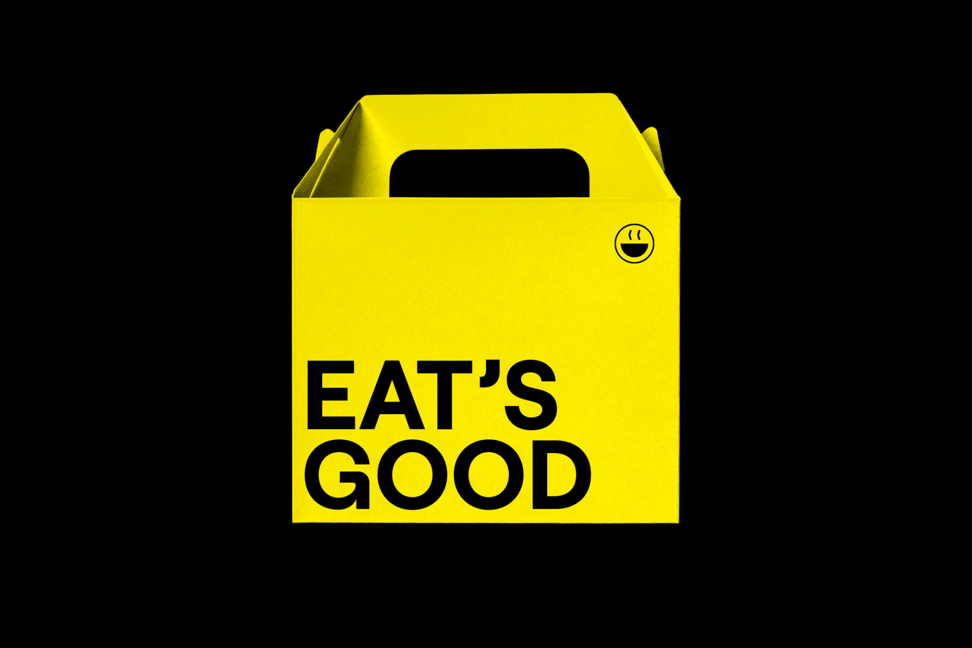
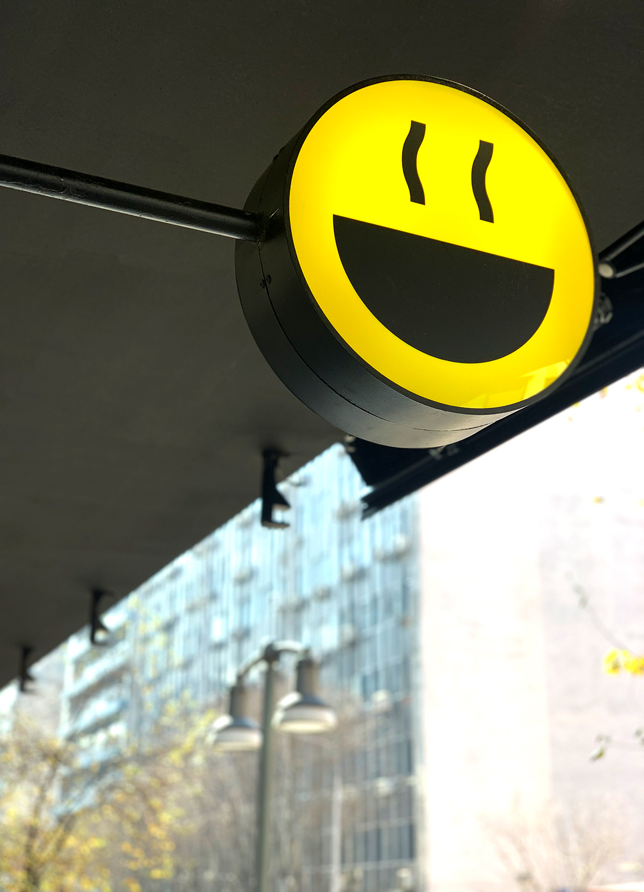
We combine the product with a modern visual language with the essence of the phrase of the brand name, and the positive approach to everyday life in general. Yellow symbolically evokes optimism, joy, and spontaneity. It is associated with laughter, hope, and the sun. In design, it is often used to attract attention in a lively and at the same time simplistic way. A series of puns that revolve around the word "eat/it" complete the basic vision of the concept. Our approach has resulted in the listing of the logo as one of the best logos.