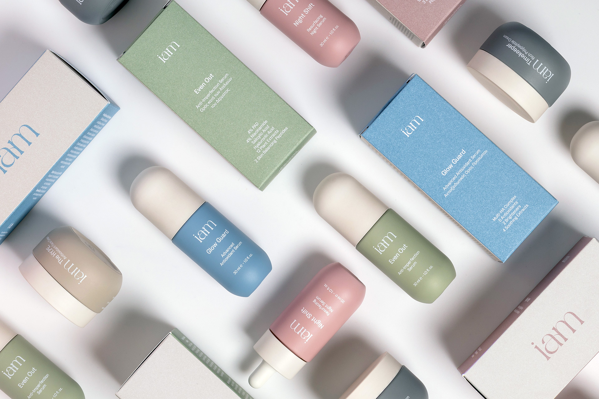
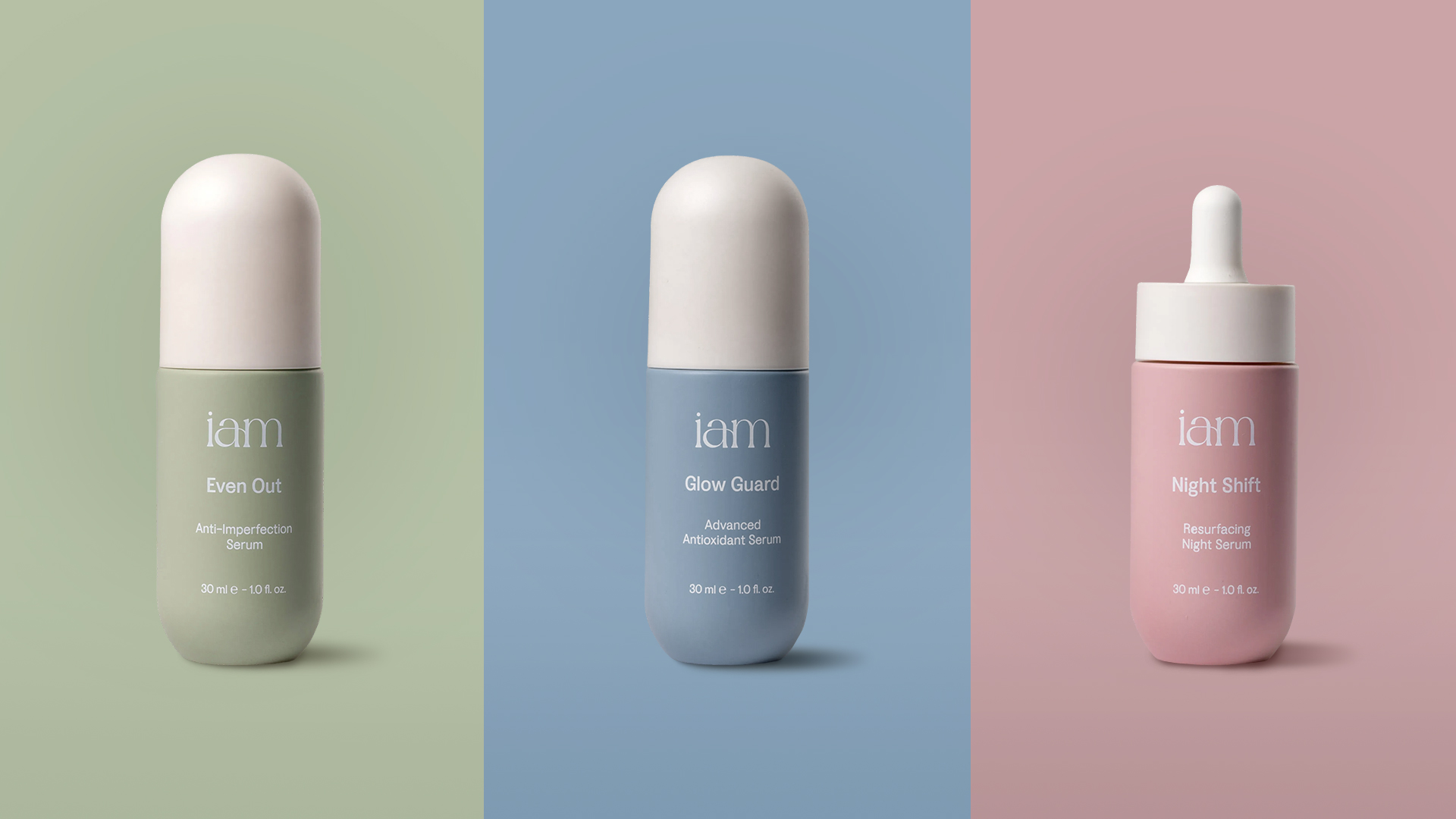
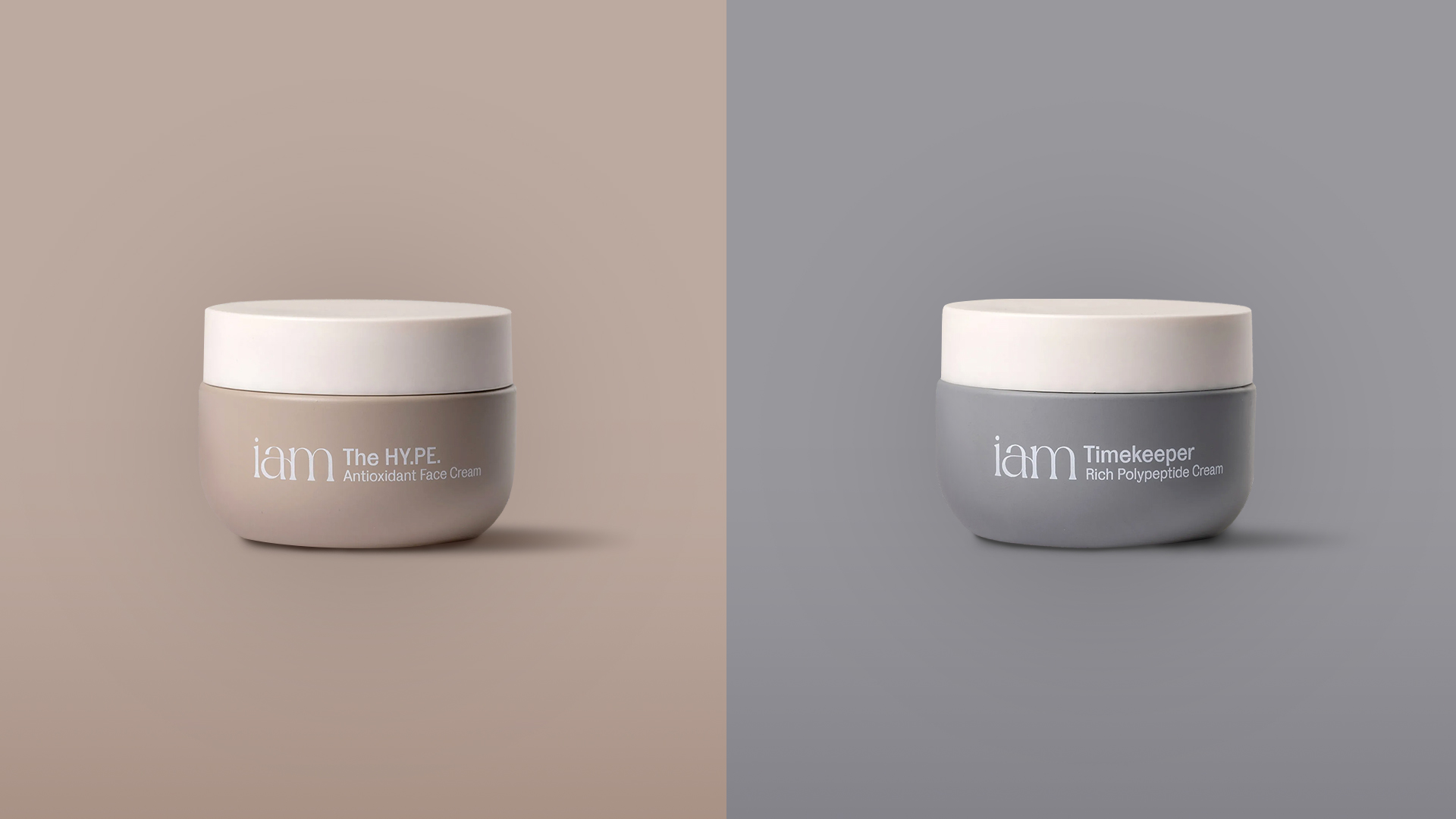
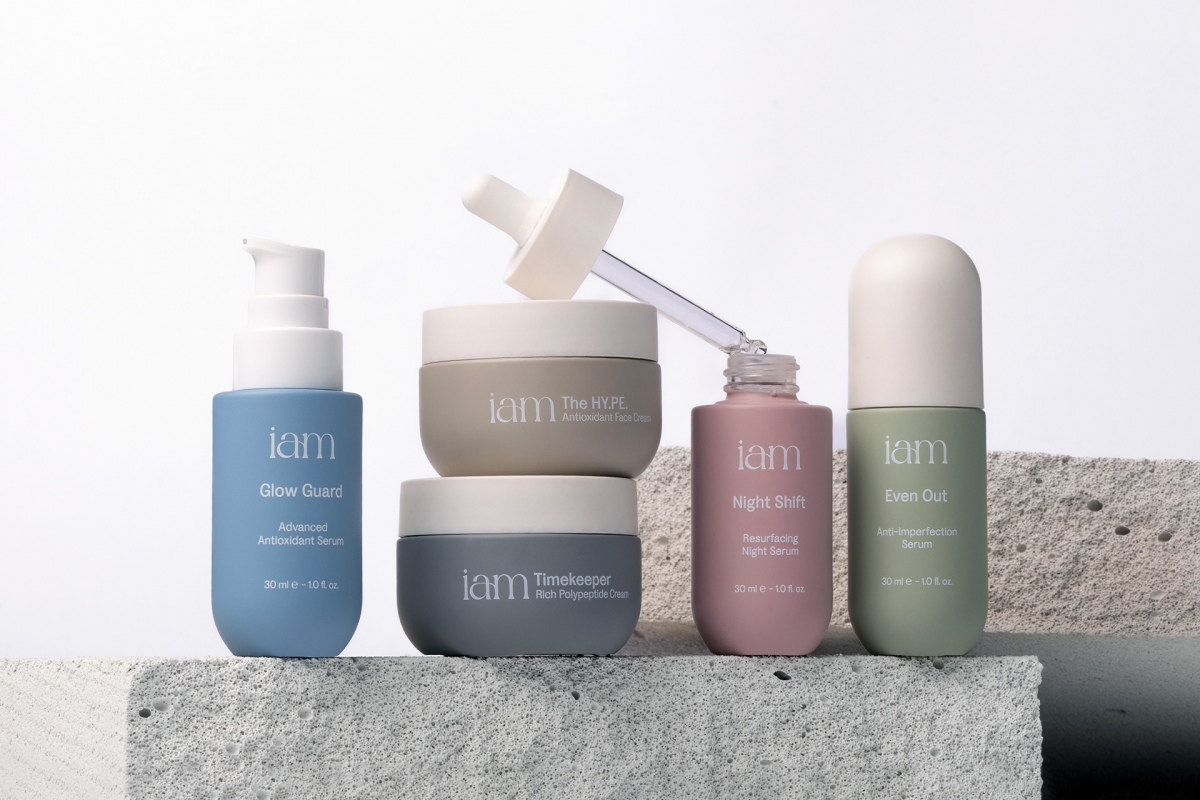
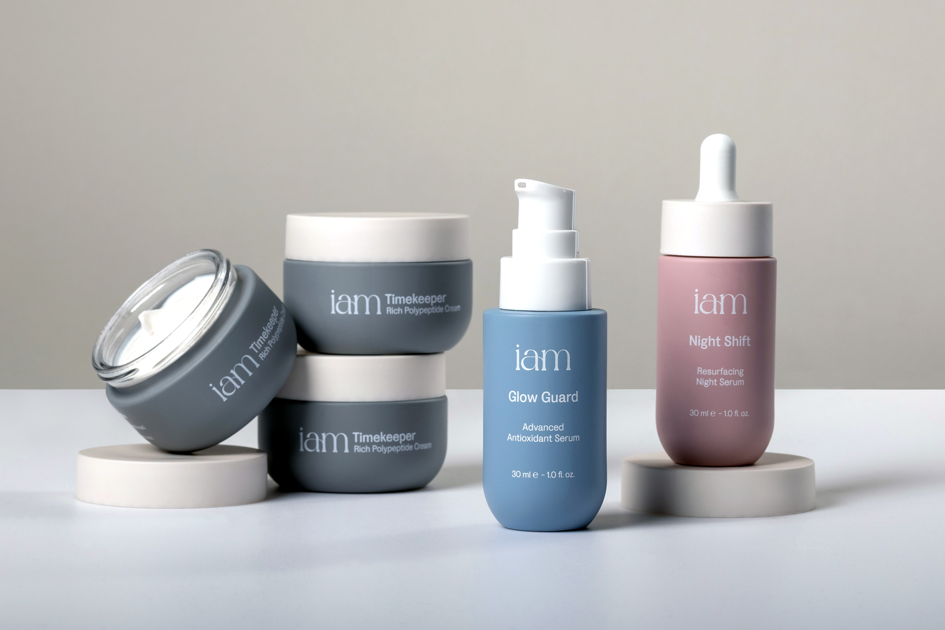
The design for iam addresses a persistent gap in the skincare market, specifically the disconnect between intimidating, sterile clinical brands and the often unscientific aesthetic of natural products. By bridging these two worlds, we developed a soft-science identity that combines the precision of a pharmacy with the warmth of a modern apothecary.
At the heart of the range are formulations fortified with high-concentration peptides, requiring a visual language that communicates potent efficacy without the clinical coldness. This approach moves away from traditional dermatological sterility toward a grounded and lived-in reality.
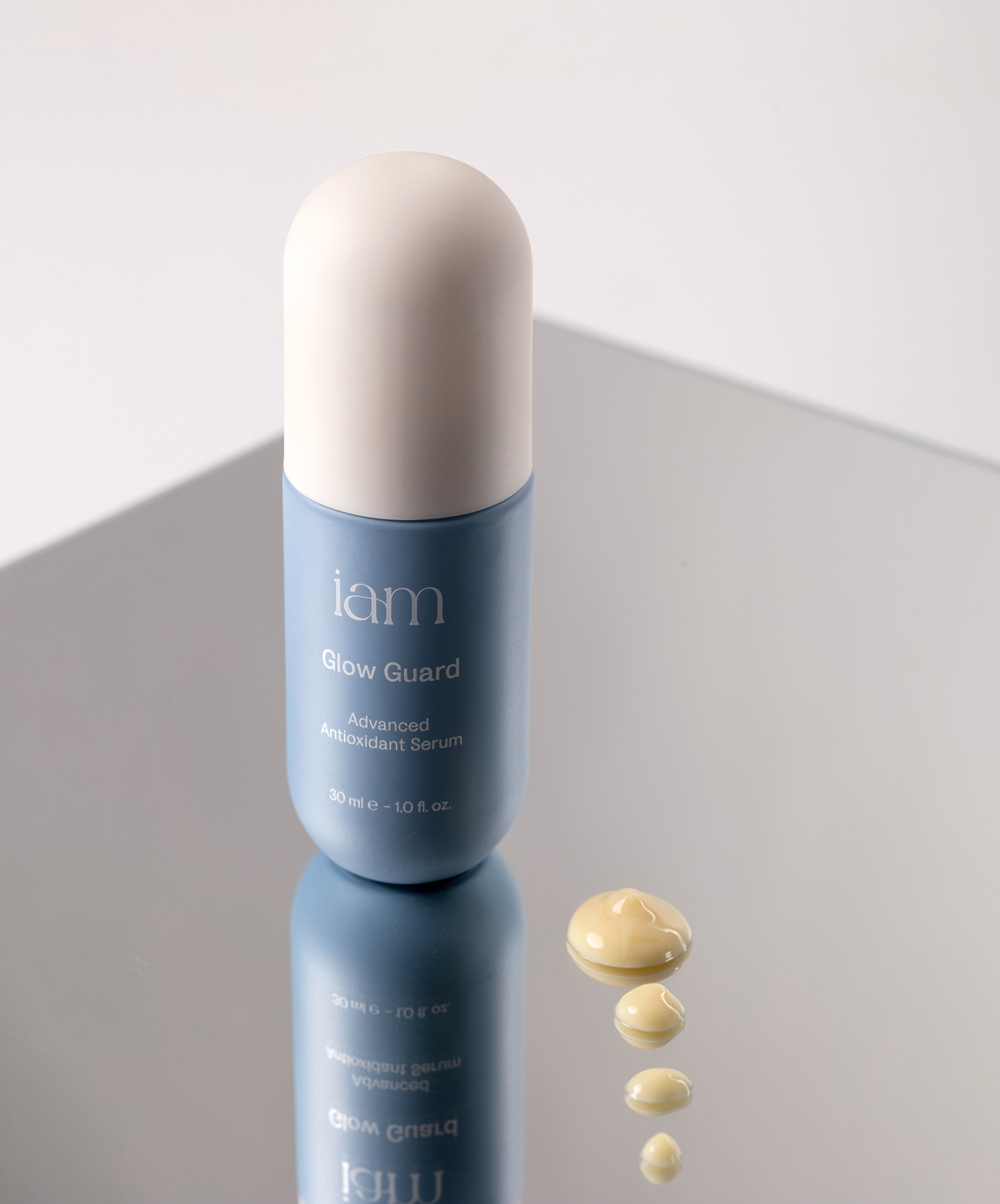
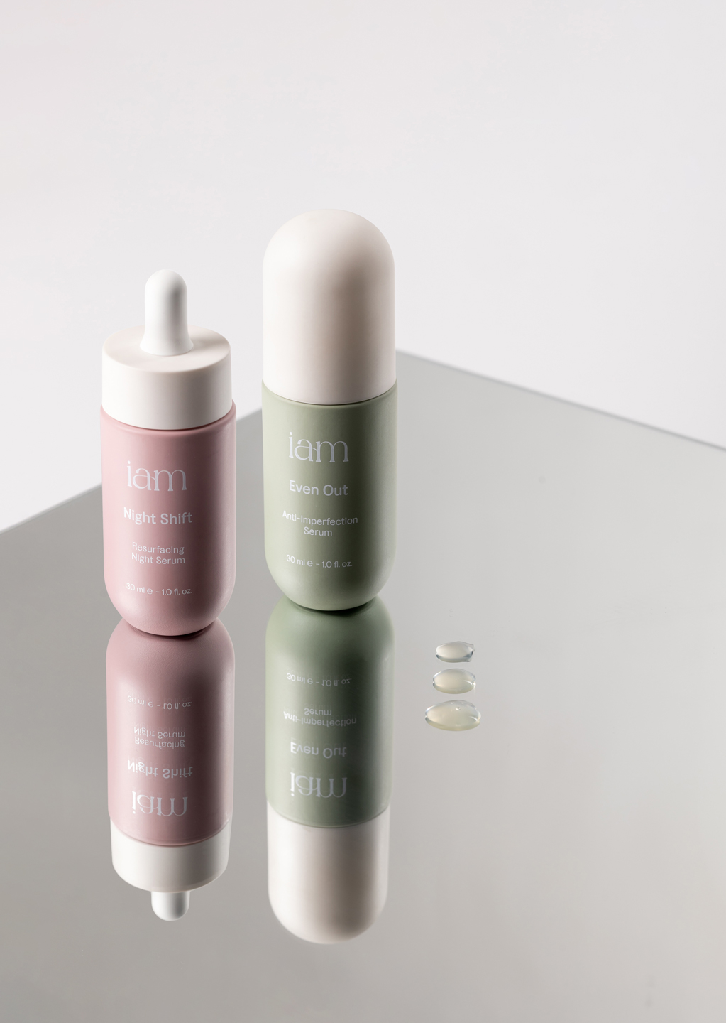
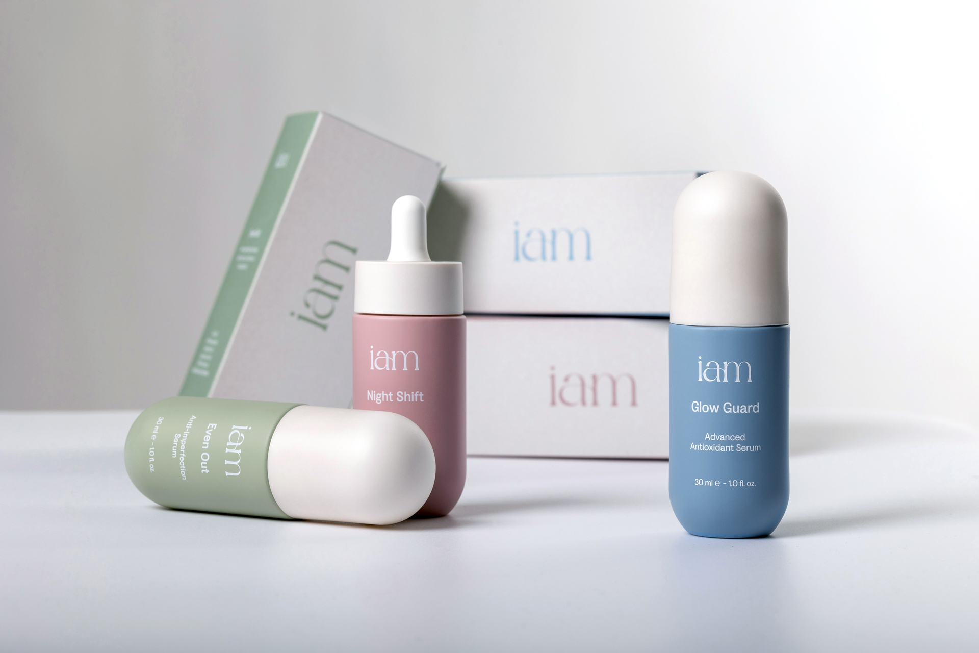
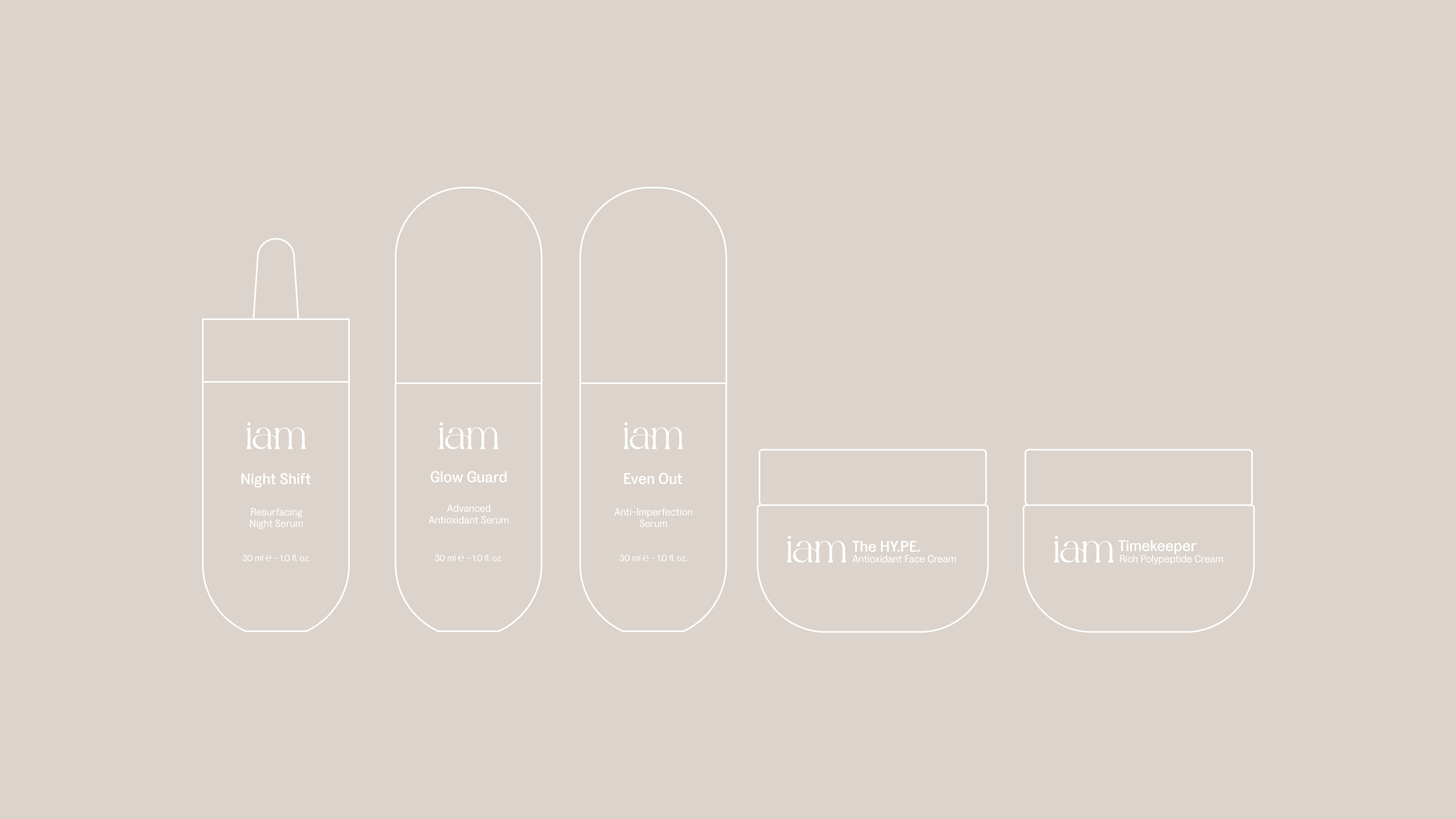
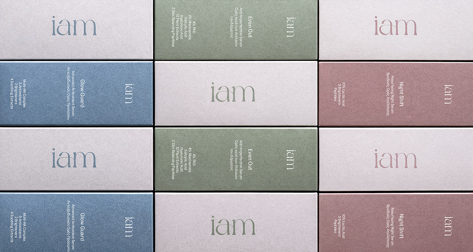
We utilized rounded capsule silhouettes that serve as a visual reference to the smooth molecular profile of these peptides, paired with a palette of desaturated, earthy tones, such as moss, slate, and dusk, to mirror the natural stability of the ingredients while maintaining a quiet, premium presence. To reinforce this high-end positioning, we selected glass containers that offer a sense of permanence and scientific purity.