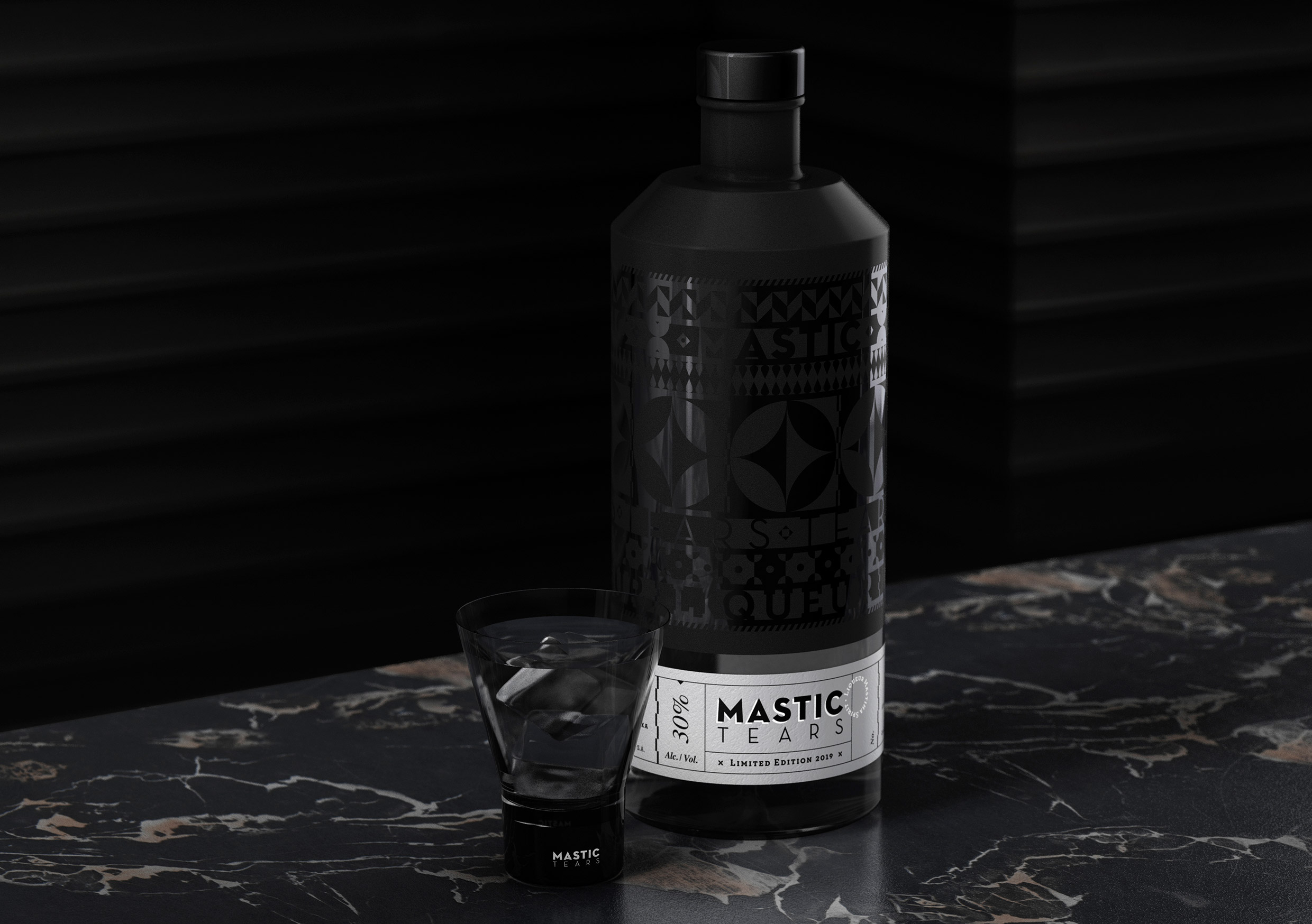
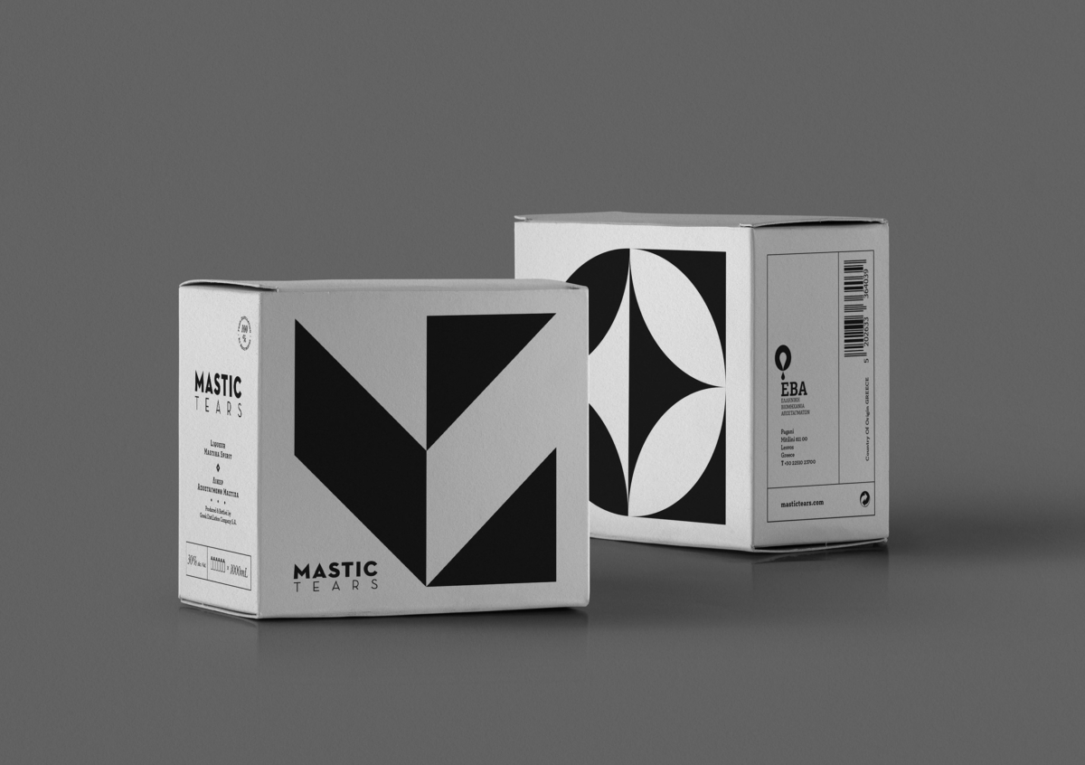
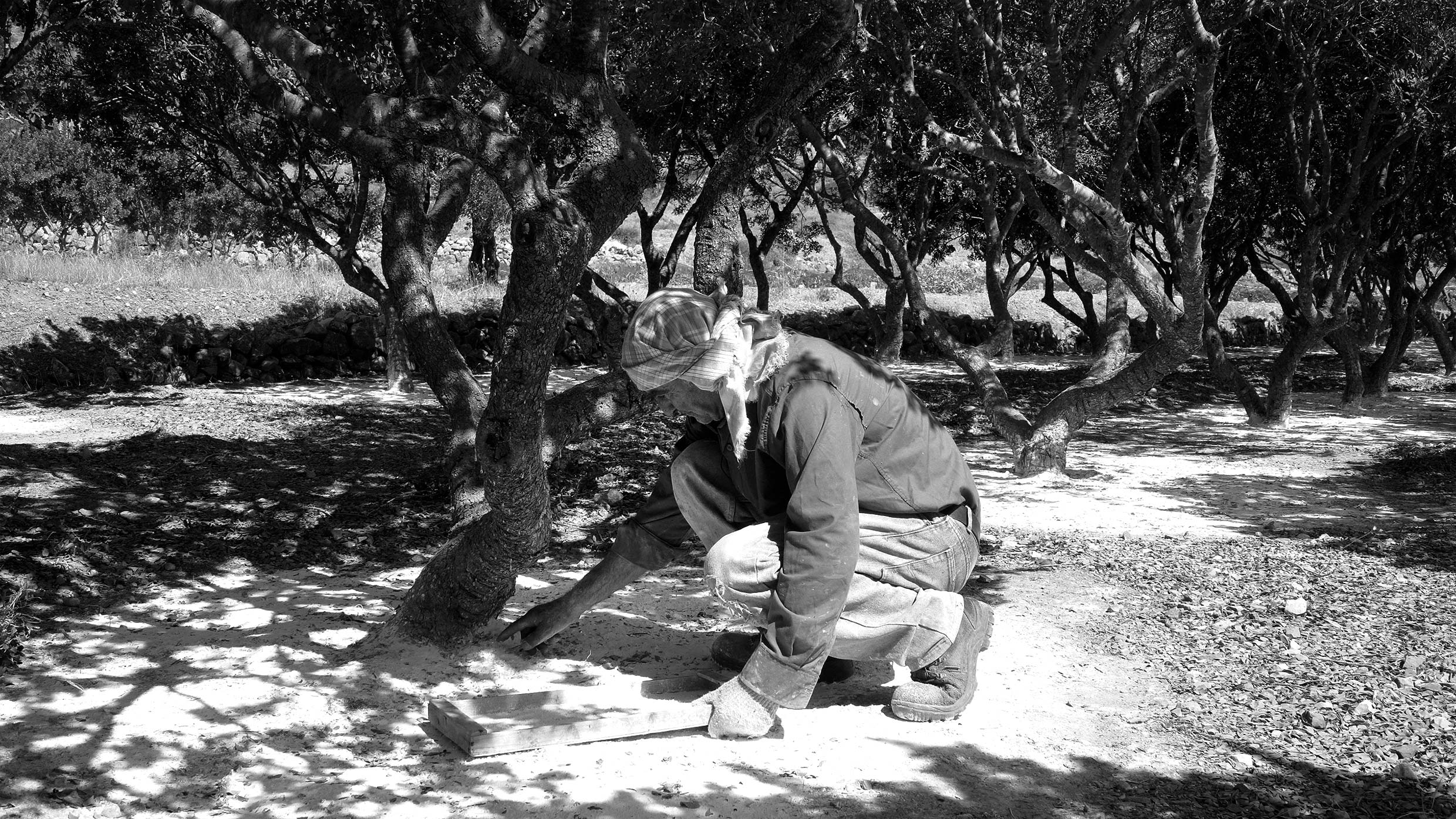
The "tears of Chios," as the drops of the mastic tree are known to have been, cost their weight in gold during the Middle Ages - this element of sense of value, courtesy and wealth we wanted to be dominant in its image product. The motifs, in turn, give space to typography, where architectural fonts from the Modernist era were also used in various weights (designed by Christian Schwartz and inspired by architect Richard Neutra). Letters open, discreetly, in which the linear geometry, the sense of space and the anthropocentric spirit of the time are also at the forefront. The technique by which the silk screen was created in the bottle was to remind us of the Italian sgraffito, the type and the way of decoration that was transferred to Mastichochoria during the period of the Latin occupation.
The embossed texture we printed to have the bottle comes from sgraffito and is achieved by printing consecutive color layers: Silk screen black on the bottle, and then embossed UV varnish. The black color, coupled with the desire for prestige, seriousness, luxury and mystery, was chosen to star in the bottle. In contrast, the label at the bottom of the bottle is made of Walmart White paper, and hot-stamped with silver foil. Here the sense of geometry is conveyed through the structure of information, the typographic hierarchy, the vertical and horizontal lines that define the space.
